Hi. I'm Jason.
I'm a product designer. I enjoy acronyms like UX and RWD, and I also enjoy donuts (but only on Saturdays).
A couple of things I believe:
Experience is the most important aspect of design.
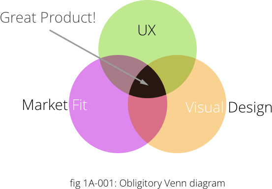
But it's part of a larger stack that all has to work together to create a great product.
Responsive design is not an option or a nice-to-have, it's a reality.
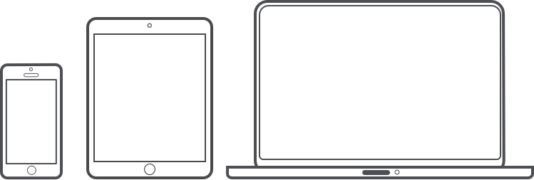
However, all mediums need to be considered.
Finally, I believe whole-heartedly in simplicity and usability.
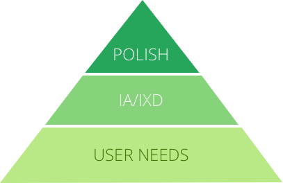
A product (or any project, really) should be useful, usable, and then beautiful.
A couple of things I've done:
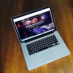
Homepage redesign
UX • UI • Web
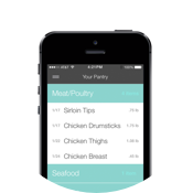
Product design
UX • UI • Web • Video • Marketing
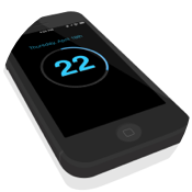
Product design
UX • UI

Hi. I'm so glad you're here.
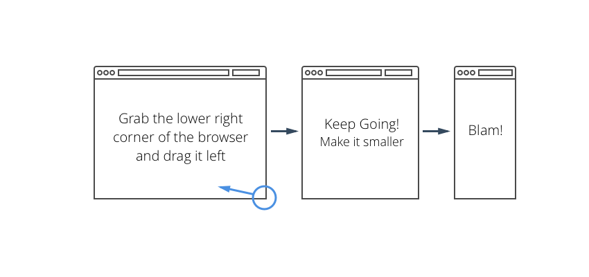
Here's the thing: I start with mobile. To view, would you mind resizing your browser?
Just grab that bottom right corner and make your window smaller, as thin as it'll go. Thanks!